Visualizations and Charts that can get your Team on the Same Page
Data visualization is becoming increasingly important in today’s data-driven world, so make sure your organization has the right tools and processes in place to leverage this powerful technology. Did you know that 30% of the neurons in your brain are devoted to comprehending visual data? Visualizations are the best way to succinctly communicate complex ideas. In addition to the four types of charts listed later in this article, there are many other types of visualizations and tools available to help you make sense of your data. Investing in the right technology and expertise can go a long way in helping you get the most out of your data – so don’t hesitate to explore all that data visualization has to offer.
Data visualization isn’t just about producing beautiful visuals – it’s about unlocking the full potential of your data. With the right tools and processes in place, you can see trends, outliers and relationships that may have gone unnoticed before – helping to drive more informed decisions. Plus, with the ability to communicate complex information clearly and concisely, you can become a leader in data-driven business intelligence. There are four main types of charts that can be used to communicate a data story: Line Charts, Bar Charts, Scatter Plots, and Pie Charts. When used correctly, these visualizations can be the difference between getting your team on board and fighting to be taken seriously.
Data Visualization: Line Charts
Line charts are an excellent tool for displaying quantitative data over time. They can be used to compare values or track changes, making them a powerful visual aid when it comes to understanding complex data sets. Line charts are especially useful for analyzing small and large changes in the same dataset, as they allow you to clearly see both subtle differences and significant shifts in trends. With line charts, you can get a comprehensive view of your data quickly and easily – helping you make more informed decisions about your business strategy.
Data Visualization: Bar Charts
Bar charts are a great way to visualize data and compare items. They can be used to show relationships between different variables, as well as track changes over time. With bar charts, you can easily see the differences between two or more values, making them an invaluable tool for understanding complex datasets. Not only do they help you make better decisions by providing an easy-to-read visual representation of data, but they also provide insight into trends and outliers that may have gone unnoticed before.
Data Visualization: Scatter Plots
Scatter plots are a powerful data visualization tool for understanding the relationships between two or more variables. They can be used to compare values, track changes over time, and identify trends and outliers in complex datasets. With scatter plots, you can quickly see correlations between different variables – helping you gain new insights into your data that may have gone unnoticed before. By leveraging this powerful visual aid, you can make better decisions and unlock the full potential of your data.
Data Visualization: Pie Charts
Pie charts are an effective data visualization tool for understanding the relationships between different categories of information. They can be used to compare values, identify trends and outliers in complex datasets, and track changes over time. With pie charts, you can get a comprehensive view of your data quickly and easily – helping you make better decisions about your business strategy.
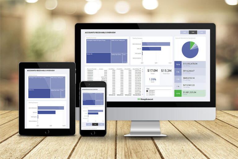
If you’re looking for an easy way to get your SAP data into charts that can inspire your team to action, check out Roundhouse by Simplement. Roundhouse can take your Real-time SAP data and power any visualization or KPI with real-time, accurate data. Roundhouse makes it easier than ever to tell stories with complex data sets and uncover insights. Easily monitor changes over time, compare values between different variables, and identify trends or outliers in large datasets – helping you drive more informed decisions about the future direction of your business. Get started today – explore all that Roundhouse has to offer!